Industry
Waste Management
Client
Circular Futures Group
Live Website
https://www.circularfutures.com.au
From branding to success

Overview
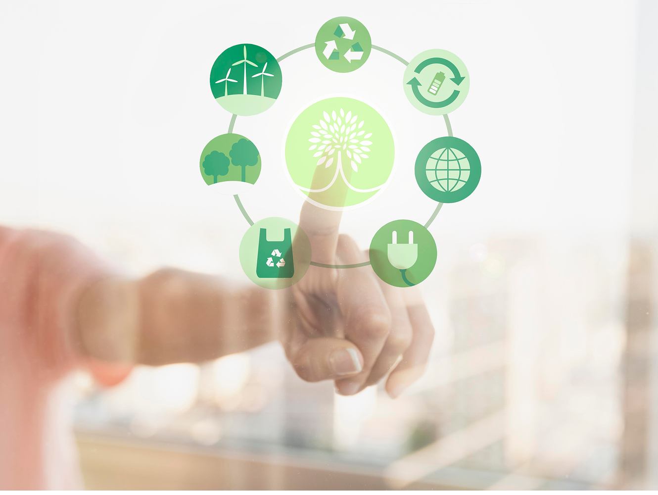
Circular Futures Group is a startup in waste management, aiming to drive sustainable solutions through recycling and circular economy practices. The founders sought a clean, modern platform with strong branding to establish their presence and communicate their vision effectively.


PROTOTYPE
TESTING
DEVELOP
WIREFRAME
DEFINE GOAL
RESEARCH
CONCEPT
Define goal
Through user interviews, we found that users were overwhelmed by excessive information and preferred quick, digestible insights. Our workshops and competitive analysis revealed that many competitor websites were not mobile-friendly and had slow loading speeds. To address these challenges, our goal was to create a website for Circular Futures Group that prioritises SEO, establishes a strong brand voice and tone, and embraces a minimalistic design for a seamless user experience.
Simplified Information Delivery

Mobile Optimization, Performance & SEO

Strategic Branding, Effective Brand Tone & Voice
Research & workshop
With the goal of creating an effective website, our collaborative workshop began with competitive analysis, SEO research, and keyword strategy. We then developed user personas and mapped their journey to identify key interaction points, ensuring a user-focused website layout.


Conceptualisation
The logo was crafted to reflect Circular Futures Group’s core values—sustainability, recycling, and innovation. We focused on a clean, modern design that ensures easy reproduction across digital and print platforms. The circular shape symbolizes continuity and the circular economy, while the chosen shades of green and blue represent environmental responsibility and trust. By refining the typography and simplifying the visual elements, we created a cohesive brand identity that aligns with the website’s minimalistic aesthetic and strengthens brand recognition.

Wireframe.
Providing bite-sized service information for a seamless, scannable experience,ensuring users can find what they need at a glance.

Lo-Fidelity Wireframe
A clean, simple interface that gets straight to the point

Hi-Fidelity Wireframe
Prototype
Testing & Iteration
During the Testing and Iteration phase of the Circular Futures Group project, we carried out thorough usability testing to ensure the website prototype met user expectations and business objectives. This involved gathering feedback from stakeholders, analysing navigation patterns, and identifying areas for improvement. Based on these insights, we refined the user interface, optimised content for clarity and engagement, and enhanced the overall user experience for all devices. Iterative testing allowed us to fine-tune the design, ensuring a seamless, intuitive, and responsive website that aligns with Circular Futures Group’s mission and meets the needs of its target audience across various platforms and screen sizes.
