Industry

Cleaning Services

Client

Whistle Clean

Live Website

https://whistlecleanaustralia.com.au/

Creating meaningful experiences

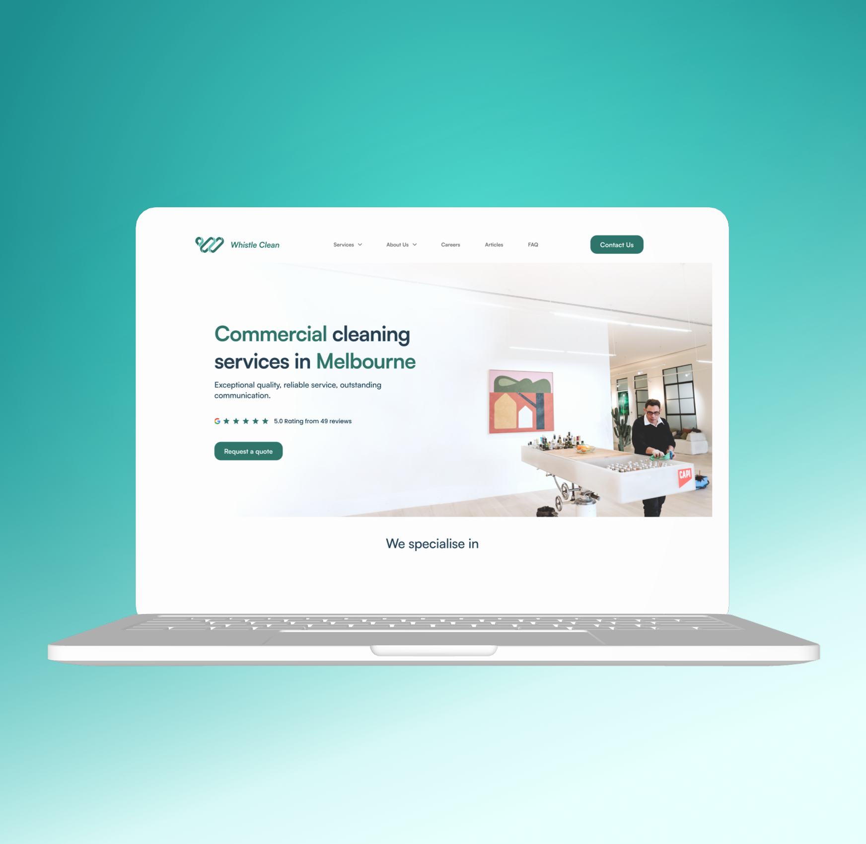
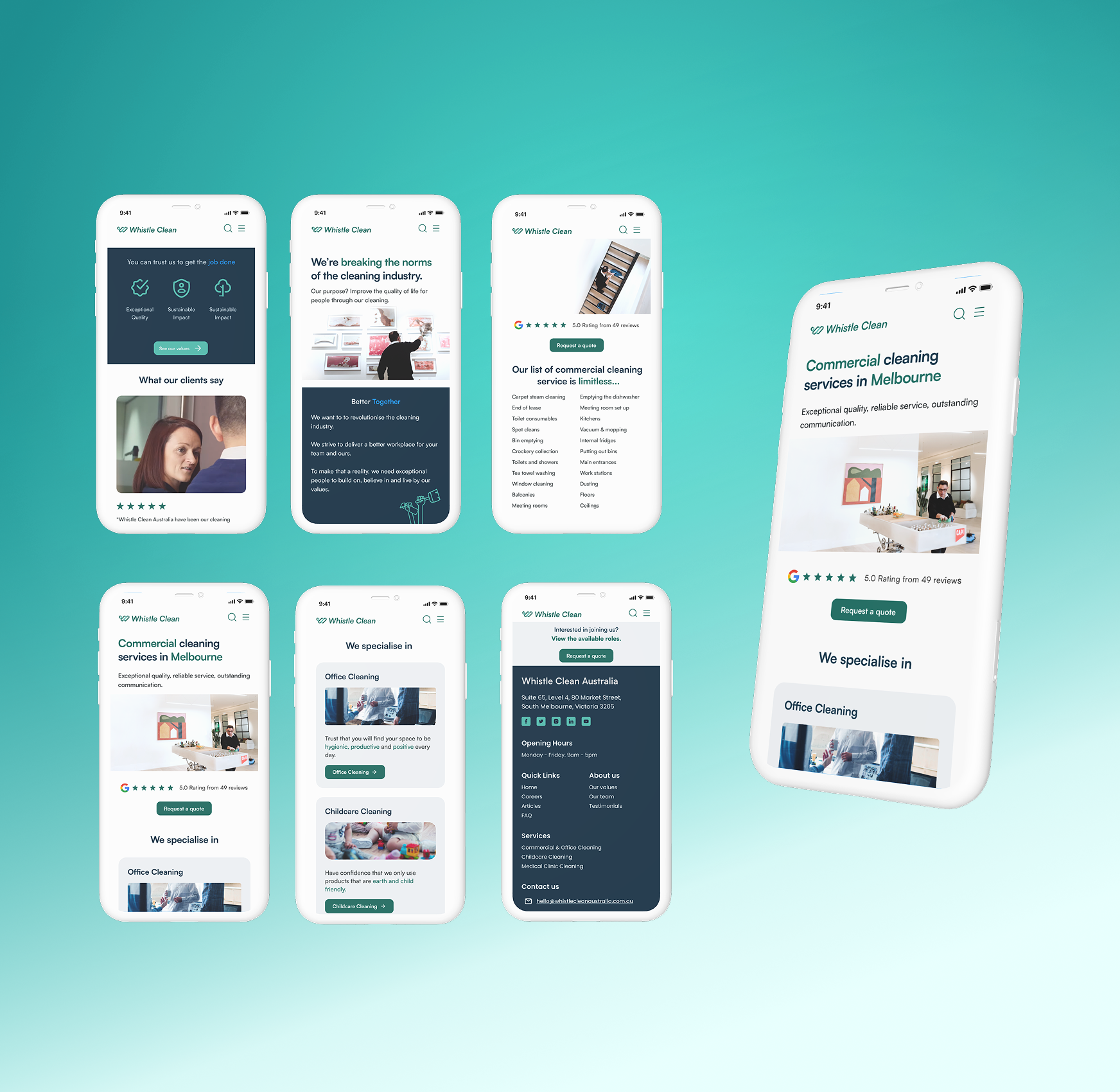
Whistle Clean Australia’s fresh new look—modern, vibrant, and aligned with their values to resonate with customers.

Mobile app interface for Whistle Clean, showcasing features like client testimonials, service lists, and cleaning specialties with a logo at the bottom.
Icon of a white dart hitting the bullseye of a target on a teal background.
Green circle with a white light bulb icon featuring a lightning bolt inside.
Web browser icon on green circle background
Icon of a computer monitor displaying HTML code brackets on a dark blue background.

Define Goal

Concept

UX Strategy

Develop

Achievement

The Whistle Clean landing page previously had an interface and imagery that resembled a consultation company. We successfully updated the images and headings to better reflect the company's brand identity and description while optimizing SEO keywords to attract more organic users. Because of these SEO improvements, Whistle Clean is now ranked high in Google search for its industry, which has significantly increased its visibility and engagement with potential customers. This strategic enhancement not only improved user experience but also established Whistle Clean as a trusted authority in its field.

Before

Whistle Clean Australia website homepage featuring a man and a woman sitting on a couch, text highlighting office cleaning services in Melbourne, a plant on a table, and a form for contacting the company.

After

A website landing page for "Whistle Clean" offering commercial cleaning services in Melbourne. Features a man cleaning a table with various bottles, an abstract wall painting, and navigation links including services, careers, and contact information.

Overview

Whistle Clean Australia, a Melbourne-based commercial cleaning company, needed a refreshed online presence that aligned with their brand values and built trust with potential clients. The goal was to create a website that not only stood out from competitors but also enhanced user experience, improved SEO performance, and effectively communicated their commitment to quality and sustainability

Person cleaning picture frames with a duster on a wall, accompanied by the "Whistle Clean" logo at the bottom.

Define goal

We began the project with in-depth research, including user interviews, competitor analysis, and customer journey mapping. These techniques provided valuable insights into Whistle Clean's audience and helped us define our goals.

Mobile Optimisation

Discoverability & Navigation

Keyword Usage

Visual Appeal

Icon of a webpage with a magnifying glass symbol, indicating search functionality.
Icon of a smartphone with geometric shapes on the screen
Icon of a web browser window with a sidebar and menu options.
Icon of a key with abstract lines, symbolizing access or security.

Research

We developed a comprehensive research plan to gain customer insights, identify pain points, and uncover opportunities for improvement. This informed both short- and long-term business strategies.

User journey chart illustrating the stages of a primary user's experience including motivation, communication, search, research, and enquiry. Each stage details user actions, thoughts, touchpoints, emotions, pain points, and opportunities for improvement. Features images and text to visualize user process.
Heuristic analysis document highlighting the issue of lack of clear feedback on users' progress. It discusses why this is a problem, its SEO impact, and offers recommendations. The image also features a "Get A Quote" button, a form for requesting a callback, and user testimonials with review ratings.
Graphic highlighting issues with style and design inconsistencies in websites. Includes examples of webpage designs, text on the importance of professionalism in design, SEO impact, and recommendation for consistent formatting.
Slide discussing inconsistencies across interactive elements with explanations, SEO impact, and recommendations. Includes a "Request a Callback" button and address for Whistle Clean Australia with opening hours.
Heuristic analysis of website navigation issues highlighting inconsistent information architecture. Includes text on user confusion, SEO impact, and recommendations for aligning site map and navigation. Examples of navigation items like office cleaning, childcare cleaning, and glossary are shown.
Illustration showing two sections of problem statements. Left section for 'Primary Users' with text about commercial space managers' frustrations, accompanied by an illustration of a person using a laptop. Right section for 'Secondary Users' with text about job seekers in the cleaning industry, next to an illustration of a person holding a mop.

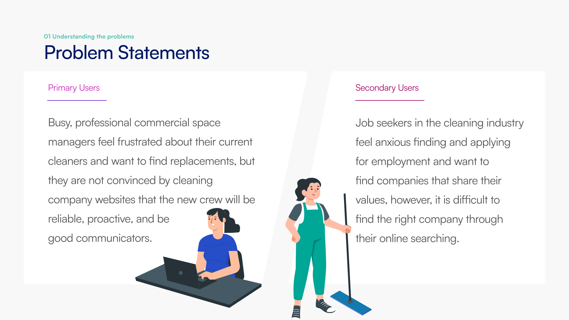
Research Workshop : Heuristic evaluation, User Journey Mapping, Problem Statement and How Might We Exercises.

Wireframe

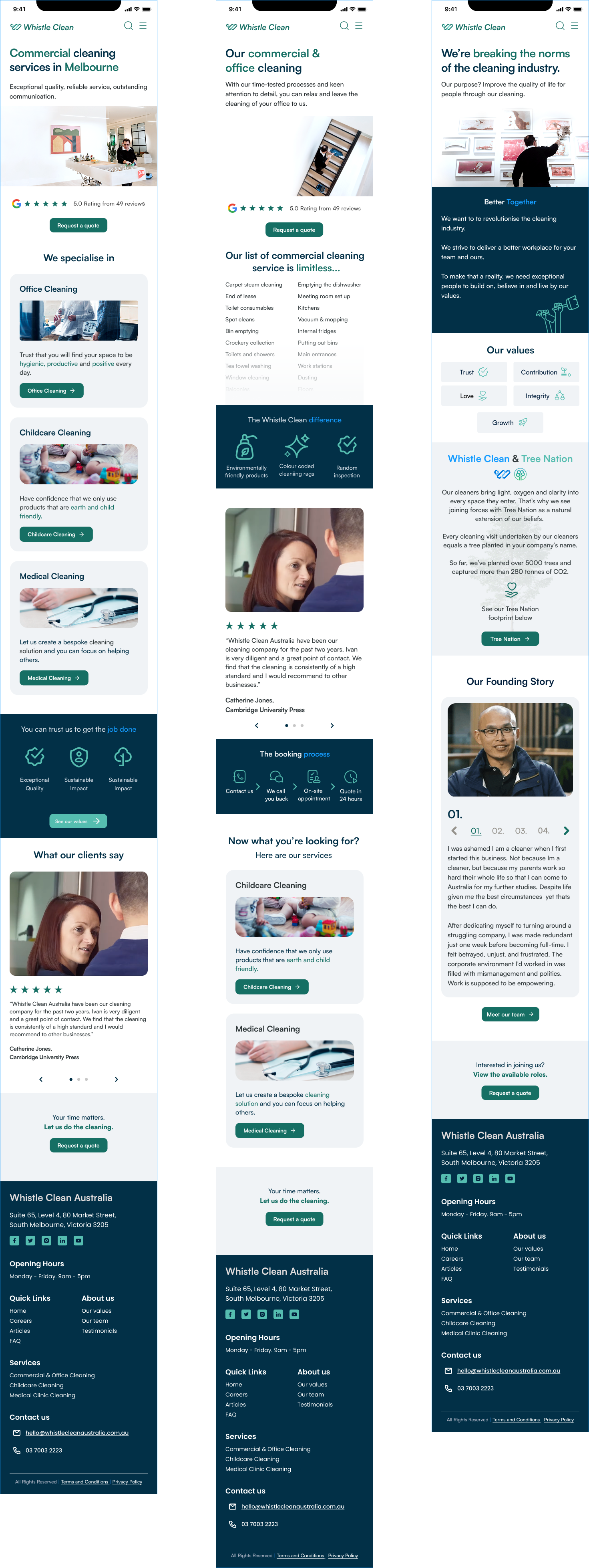
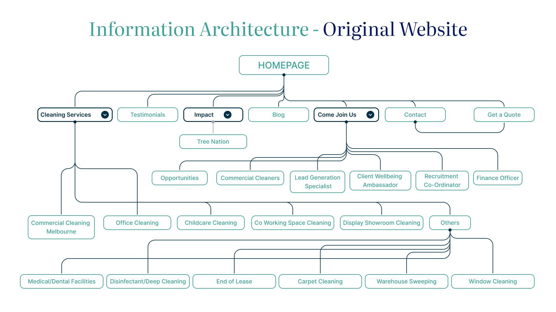
During the wireframing stage, we focused on a simplified information architecture to ensure easy navigation and quick access to key information. The interface and imagery were designed to effectively express the company’s values while enhancing the overall user experience.

Screenshot showcasing a series of web pages from a commercial cleaning service website, featuring sections on services offered, team members, client testimonials, articles, FAQs, and contact information. The design includes images of cleaning activities, team portraits, and client reviews, all laid out in a clean, professional style with a consistent color scheme.
Three screenshots of a website for Whistle Clean Australia, showcasing their commercial cleaning services in Melbourne. Sections include service descriptions for office, childcare, and medical cleaning, client testimonials, company values, and contact details. The site promotes effective, sustainable cleaning practices and features user-friendly navigation.

Prototype

For the Whistle Clean prototype, we designed the website with the company’s ethos at its core, ensuring its commitment to exceptional quality, sustainability, and reliability was reflected in the user experience. Our approach involved refining the visual language to create a clean, modern, and engaging interface that stands out from competitors. To enhance search engine ranking and visibility, we recommended an SEO strategy incorporating key industry terms, helping Whistle Clean reach its target audience more effectively. The result is a user-friendly, visually appealing, and strategically optimised prototype that aligns with the company’s values while improving its digital presence.

Laptop displaying website for a commercial cleaning service in Melbourne, featuring a modern, bright office scene with a person cleaning and a five-star review rating.
Mockup of a commercial cleaning service website displayed on smartphone screens, showcasing pages like client testimonials, cleaning services offered in Melbourne, and contact information on a teal background.

Conceptualisation

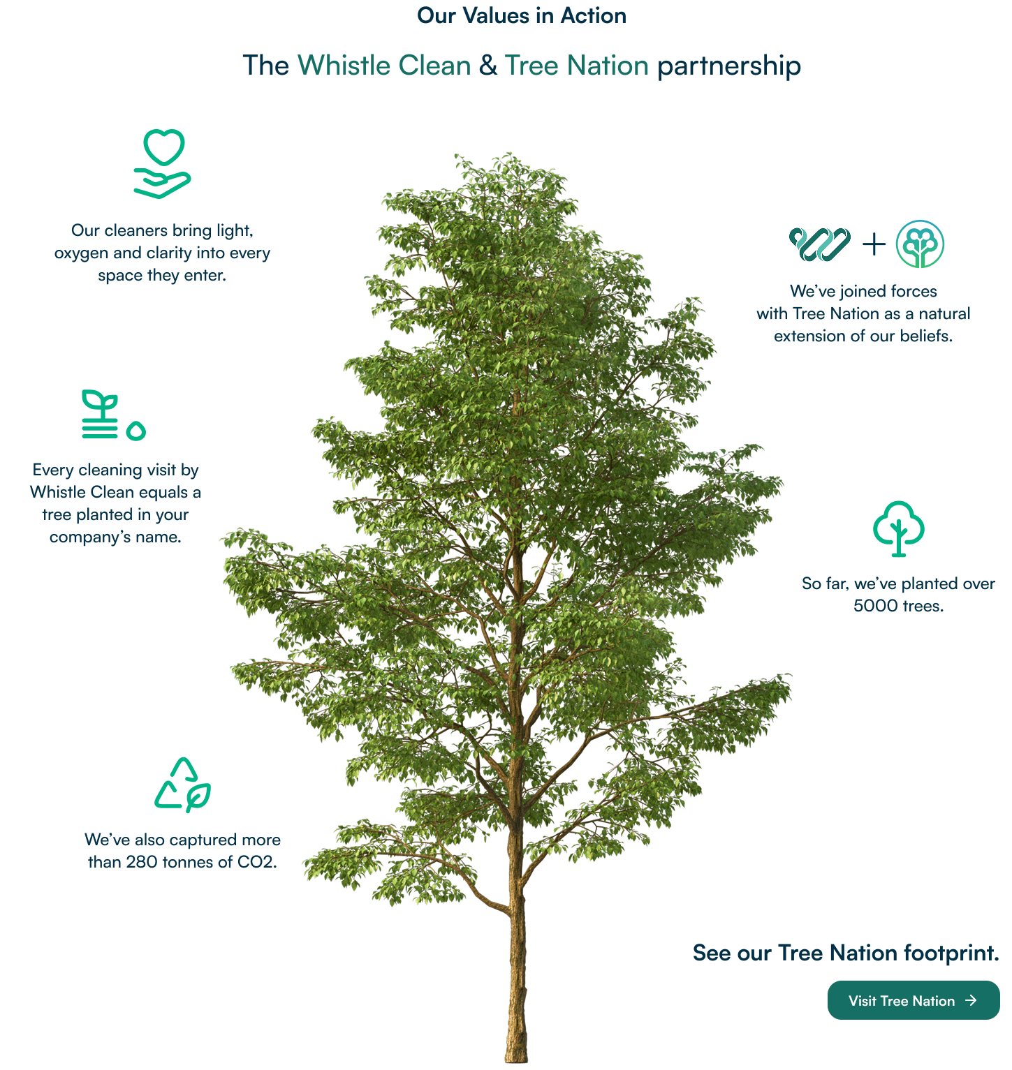
The Whistle Clean Australia project focused on enhancing the company's digital presence through a user-centric website redesign. We carefully selected a color palette that embodies Whistle Clean's principles of love, trust, growth, integrity, and contribution. Additionally, we integrated a tree motif throughout the design to highlight their commitment to the Tree-Nation program, where each cleaning visit results in a tree being planted, contributing to global reforestation efforts. By aligning visual elements with Whistle Clean's ethos, we crafted a digital experience that resonates with clients and reinforces the company's dedication to quality service and environmental stewardship.

Design system image featuring color swatches, typography styles, button styles, and icon set. Includes categories labeled 'Colours', 'Type Pairing', 'Typography', and icons for various services and values.
Illustration showing a partnership between Whistle Clean and Tree Nation, featuring a green tree at the center. Text highlights environmental initiatives: each cleaning visit plants a tree, over 5000 trees planted, more than 280 tonnes of CO2 captured, and a link to see their Tree Nation footprint.

Before

Information architecture diagram of a website showing homepage with branches to sections like Cleaning Services, Testimonials, Impact, Blog, Come Join Us, Contact, and Get a Quote. Sub-branches include various cleaning services and roles like Commercial Cleaners and Finance Officer.

After

Diagram of website information architecture redesign. The homepage links to 'Services,' 'About Us,' 'Careers,' 'Articles,' 'FAQ,' and 'Contact Us.' 'Services' connects to 'Commercial Offices,' 'Childcare Centres,' and 'Medical Centres.' 'About Us' expands to 'Our Team,' 'Our Values,' and 'Testimonials.' The 'Contact Form' links back to various sections.

Develop and deliver

During the Deliver phase, we conducted user testing to gather valuable feedback and refine the prototype further. Our findings highlighted the importance of prioritising accessibility and intuitive navigation to enhance the overall user experience. Based on this feedback, we made necessary adjustments to ensure the site was user-friendly and inclusive. The client was extremely pleased with the final outcome, recognising the improvements made and the strategic approach taken. As a result, they proceeded with the development of the live site, bringing our design recommendations to life.

Computer monitor displaying a website with sections for office, childcare, and medical cleaning services, each with corresponding images and descriptions, on a blue background. Logos of various companies are below the sections.